Living History
Donate to LHVW

The Gabriel Chandelier, first permanent installation of contemporary artwork in Versailles

Leopoldina
@leopoldina
11 years ago
280 posts

tumblr_mwyji0YHmW1qatfdco1_1280.jpg?width=256

UNVEILING

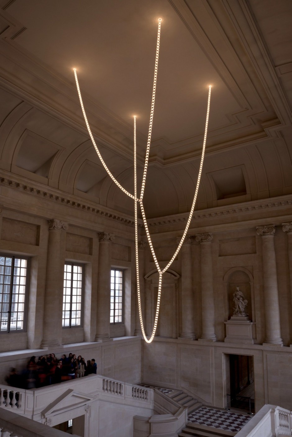
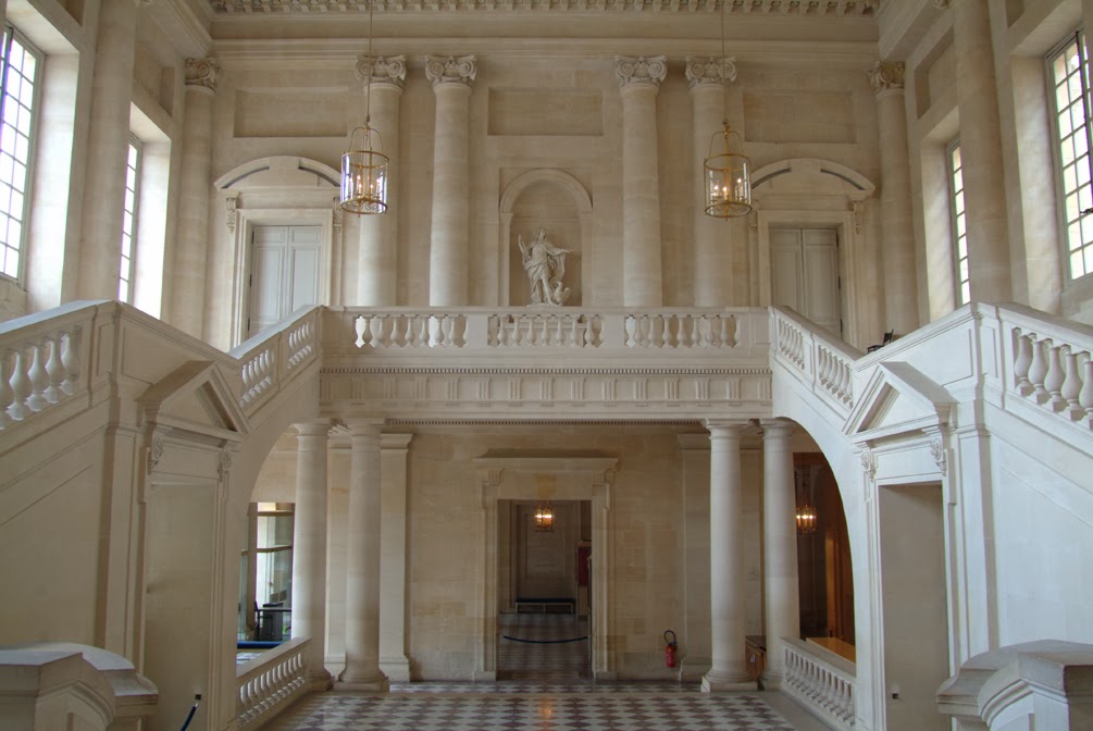
11 November 2013, the Gabriel Chandelier was set up at the Palace of Versailles. This contemporary artwork, designed by Ronan & Erwan Bouroullec and realized by Swarovski, will permanently enlighten the Gabriel staircase.

First permanent contemporary artwork

In 2011, the Palace of Versailles launched a competition tocreate a permanent mobile artwork to adorn and illuminate the grand Gabriel Staircase. The award-winning project : a majestic chandelier, made by the artists Ronan & Erwan Bouroullec , whose modern linesharmoniously integrate with the historically charged location.

The Chandelier is formed of three interlacing strands, each made of hundreds of crystal illuminated by luminous LEDs light-sources which diffuse a soft light . These immense, supple lines form an organic design ruled by the laws of gravity. The crystal establishes a strong link with the past since this material is traditionally used in the making of chandeliers in Versailles.

The Gabriel staircaise

Located at the entrance of the Grands Appartements , the Gabriel staircase conceived by Ange-Jacques Gabriel in 1772, was never completed. Work resumed in the 1980s, but the finished staircase lacked a focal point. The Gabriel Chandelier will enrich these historic surroundings whilst preserving the unique nature of the space.


loadResourceDocu.php?id=3D1DFF36-0011-7CD8-776F-390FFCF706FB&code=WSWImage&idLanguage=200F0FC2-5609-102C-8399-000C2991753C A Word from the artists

We had to produce a piece which possessed character but which, unlike several contemporary art initiatives at Versailles in the past, was not a temporary installation, nor a work of art, nor an exhibition. The design brief was to create a chandelier to light the Gabriel Staircase. [...]

Then we thought that in the final analysis it was not perhaps necessary to give a delineated form to this piece of lighting but rather to try to arrange it so that the form naturally found its line from gravity. In this way we developed the idea of twists of crystal suspended from four points on the ceiling and tracing loops which subdivide into organic trees. In the end its shape arrived almost naturally.

Ronan & Erwan Bouroullec


loadResourceDocu.php?id=ED066CE7-EA09-276A-7B48-7A5E65A62D0A&code=WSWImage&idLanguage=200F0FC2-5609-102C-8399-000C2991753C

The patron

Swarovski helped to restaure some of the chandelier of the Palace by creating a candle lit by a flame in crystal LED allowing to reproduceperfectly the appearance, ambiance and tones of 17th century candle-lit chandeliers. These chandeliers can be found in Mesdames' apartments , the King and the Queen's Grands Apartments, the apartments of the Dauphin, Dauphine, as well as in the King and Queen's smaller apartments.

The Gabriel Chandelier was designed by Ronan & Erwan Bouroullec and realized by

Swarovski

[ Source ]

----

I have mixed feelings about it, but I haven't formed an opinion yet, what do you guys think about it?


updated by @leopoldina: 06 Apr 2019 07:18:48PM
Sidonie Laborde
@sidonie-laborde
11 years ago
83 posts
I dont like it and I dont like all these modern art exhibitions with that balloon and manga stuff they did in the last years.
Yes Versailles was and is a place for culture and art but is that really neccessary? The have such great and wonderful rooms and art objects - cant they stay for alone? Arent they enough?
I think they should have taken the money to restore something or to purchase an object from the history of Versailles. Same with the new garden that is in progress - a contempory garden. Arent there enough places in the world for such modern things? In Versailles I want to feel the past, breathe it in. I want to to imagine all these great historical person inside this splendid halls and rooms. But it doesnt work with such things inside.

Of course it could have been worse. The design of the chandelier is quite simple, I dont want to imagine a Jeff Koons chandelier there =S
LouiseBathilde Sapphire
@louisebathilde-sapphire
11 years ago
100 posts

I hate it, I think they are ruining the Palace!

Candace Ducatillon
@candace-ducatillon
11 years ago
204 posts

Not impressed in the least.

Jane Ixtar
@jane-ixtar
11 years ago
115 posts

For a start it's very 1990's so it's already out of fashion. Quelle horreur! For an artwork to be relevant it needs to be critical and by the very choice of its location it will be required to throw into question much of whatVersailles stands for. If it were astonishingly beautiful I personally may give it the time of day but in comparison to the calibre of the workmanshiop and the thousands of hours of labour, love and commitment by the artisans of the pieces alreadytrashed enough at Versailles, this is drap and banal. We do not need this patronising light. Have them take it away and I hope it does not represent what we are to expect in the future.

MarieLouise Harcourt
@marielouise-harcourt
11 years ago
647 posts

I am not a very big fan of modern art, and I think showcasing modern art works disturbs the harmony or balance of Versailles. Then again, I am not a big fan of modern art in general, so that might have something to do with it. However, regardless of my personal feelings, Versailles is also a museum, and I think nothing is wrong with some experimenting with art on the side of the Versailles' management. As I said, Versailles is and will remain a museum, and I do think it could be a great platform for upcoming artists. Besides, what greater stage is there, than Versailles? Especiallywhen there is a link with that what Versailles represents, I think it should be fine, especially since it is only contemporary.

Jane Ixtar
@jane-ixtar
11 years ago
115 posts

I am a big fan of modern art and very recent art and I appreciate the briefing would have produced submissions for work that would not or could not sit beautiflly with the existing place. I do appreciate this. But I have seen this line, the draping, the smart assarchitecturalness of it too much and versailles deserves better. It is lacklustre and frumpy. I'll never like it.

Ekaterina Petrovna Shuvalova
@countess-shuvalova
11 years ago
209 posts

I understand the idea of bringing modern uses to the ancient palace. Versailles would never be able to sustain itself as if it always stayed the same ,and contained the same thing, it needs to adapt in ways its contemporary times. Seemly that's something the ancien regime couldn't learn, but look what happened to them...

I like the idea of a modern style to breath new life into the old rooms. However I find that is dreadfully ugly. I may not love contemporary art, but I appreciate it. I think they could have done something more suitable in a modern sense, but perhaps keeping some sort of traditional idea or style, this doesn't quite cut it.

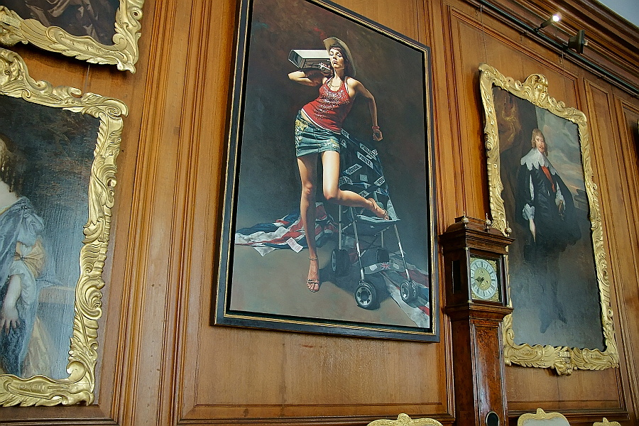
Charles Spencer, 9th Earl Spencer currently lives in his ancestral home of Althrop House, Northamptonshire, recently added a picture to its picture gallery in the house. The hall was decorated with portraits, where there is one modern one :

_DSC0956.jpg Here, the picture is shocking and modern, a scandalous work, which is in reference to some of the handsome paintings, which were shocking at the time they were painted.

Jane Ixtar
@jane-ixtar
11 years ago
115 posts

If the new works illuminatethe worksin which they share the space with, then something is gained. I sense that this paintng may show the female subects of times passed in a good light. I'm looking at the guy to her left and he probably hasn't benefitted as much however. :))

Jane Ixtar
@jane-ixtar
11 years ago
115 posts

lol, yes Sidonie ooh .. I wonder what he submitted??

Aldo Stern
@aldo-stern
11 years ago
157 posts

it's not a bad piece per se, and in a different context, it arguably could work really well. But I'm not sure that the placement of this contemporary minimalist piece within an environment of neoclassical symmetrical complexity was the best possible choice. It's like putting your grandmother in a bikini. Both things in their proper context are wonderful, but combined together...um...well...the effect may be memorable but not necessarily for ideal reasons.

If they had to have a lighting fixture produced by a living artist, I wonder if something by Dale Chihuly -- or someone who does work like his -- might not have been a better choice

Jane Ixtar
@jane-ixtar
11 years ago
115 posts

I agree, the piece itself would be great in a modern building, polished concrete even, devine, a nightclub. Absolutely and it references minimalism and pieces made usinglight in the 1960s for sure. So anywhere mostly except Versailles.Having said this, if it weredrop dead elegant and minimal I would have to concede and like it.But it is cumbersome and so unlike the exhuberance and lightness of Versailles in its physical sense. I 'm sorry I need to stop going on about it. maybe I'm too soft but It really upsets me though, frankly I couldn't even hammer a nail into a wall there, let alone do this.

Lady Leena Fandango
@lady-leena-fandango
11 years ago
358 posts

It's very odd, kind of like the Christmas lights are falling off the ceiling?

The lack of symmetry in the piece is throwing it off, imho ... and to have it at Versailles just seems strange.

This is a great discussion though, interesting to read everyone's opinions :)

Lady Leena Fandango
@lady-leena-fandango
11 years ago
358 posts

The new portrait at Althorp, it's just so odd and out of place ..... though I'm sure it's quite a conversation piece :)

Jane Ixtar
@jane-ixtar
11 years ago
115 posts

I guess it's just to let us know that they are aware of the short comings of salon art for one thing, that they are contempory thinkers butI agree I think just one odd one is too odd. Leave the room as it was.Everybody knows anyway.. :D

Summer Serendipity
@summer-serendipity
11 years ago
69 posts

It looks like a doodle scribbled on an Old Master ... or a discarded draft desperately pulled from the wastebasket as the deadline arrived faster than a viable idea had.

Jane Ixtar
@jane-ixtar
11 years ago
115 posts

OH HAHAH Halleluja!

Leopoldina
@leopoldina
11 years ago
280 posts

Oh I love that, good sense of humor and yet it still maintain the realistic portrait style.

And as Leena said, must be a great conversation piece :p

Candace Ducatillon
@candace-ducatillon
11 years ago
204 posts

A perfect Summeresque description !!

Leopoldina
@leopoldina
11 years ago
280 posts

I think looking from afar, the chandelier it looks pretty and elegant, not so much on a closer look.

But then, as it was pointed out, it looks very out of place, being an asymmetrical LED chandelier in a neoclassical room, which is very symmetrical.

Of course Versailles has been through changes since its start, but still I am not sure if I like the idea of a permanent contemporary piece of art inside a historical room. It breaks the immersion and historical feeling of it. There is so many other places this could be installed.

Lady Leena Fandango
@lady-leena-fandango
11 years ago
358 posts

LOL, that's a great description Summer :D

Tatiana Dokuchic
@tatiana-dokuchic
11 years ago
1,919 posts

Well, to be honest, it's starting to grow on me :)

I don't think I can really judge it without seeing it in rl (which isn't going to be happening soon). I do like the description ofthe soft light it diffuses.

I hear you all though when you say it resembles glorified Christmas lights & the asymmetry is kind of an affront to my symmetrical-loving brain but maybe it's stunning in person. What's the French term, "jolie laide" ;)


--
Proprietress of Tatiana's Tea Room ~ Owner of the Provence Coeur Estate ~ Webmistress of this site
Candace Ducatillon
@candace-ducatillon
11 years ago
204 posts

Interestingly enough Dear Comte, I can handle this carpet ... but the ceiling fixture is another story!Thank you for your contribution to this!

Summer Serendipity
@summer-serendipity
11 years ago
69 posts

Thank you all for your kind comments. I'm a firm believer that a good laugh can take the sharp edge off almost ANYTHING. ( ;

Aldo Stern
@aldo-stern
11 years ago
157 posts

An interesting example, thank you for sharing that Signor Conte.

Actually I think this one works: first of all the geometric shape of the fixture complements and arguably reinterprets the symmetrical formalism of the neoclassical room; then you add in the geometric carpet (which has s certain formality of its own), and the utilitarian modern furnishings, the overall effect is a fun and functional whole.

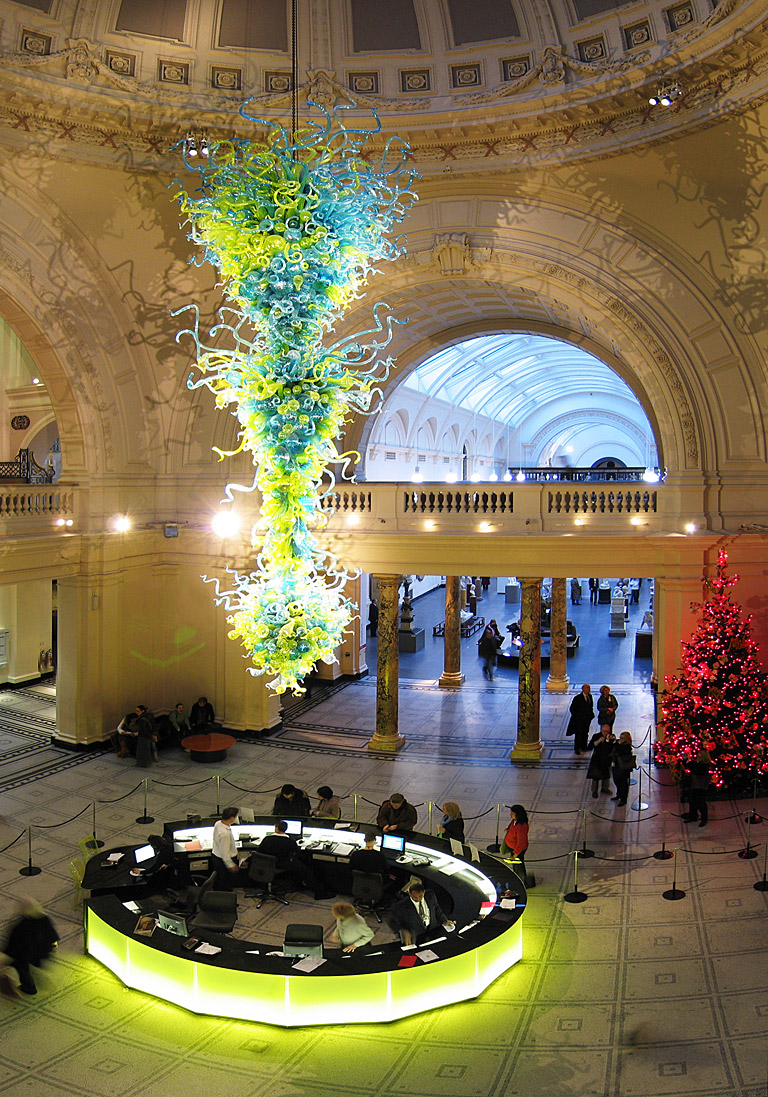
Sometimes interesting things happen when the right contemporary piece is placed in an historic environment. Below is Dale Chihuly's chandelier in the rotunda of the Victoria & Albert.

2751_discussions.jpg?width=721 of course, the information booth is modern as well, so it is a bit more of an integrated approach than what was done with the Gabriel staircase. In fact, as I said, I could see a Chihuly chandelier (possibly in white) working rather well in a place like the Gabriel staircase, in part because his pieces do have a certain form of bizarre symmetry, as well as a complexity that reflects the complexity of certain historical styles. They also represent a massive amount of time and skill that the fabricators put into creating something like a Chihuly chandelier. The piece at Versailles looks remarkably industrial, even though it is constructed of numerous crystal elements (which arguably took similar skills to create, but they don't visually reflect the application of those skills). The point that was made earlier -- that it is hard to tell from the picture just what the actual visual impact you would get of the chandelier in the Gabriel staircase if you saw it in person --I would also suggest it would probably look very different and create an entirely different effect if seen at night (instead of during the day as it obviously is in that picture). But then I would be intrigued to see what kind of reflections and shadows a more complex installation would create in that same space at night.

Lady Leena Fandango
@lady-leena-fandango
11 years ago
358 posts

I agree with Candace, the carpet is alright but I don't know about the light .... an acquired taste I think.

A great addition to the discussion Comte :)

Lady Leena Fandango
@lady-leena-fandango
11 years ago
358 posts

I like this combination, the flourish of the chandelier accentuates the space, imho. And the modern touch on information booth makes the lighting make more sense than the example given at Versailles.

Wonderful photo and discussion Professore :)

Leopoldina
@leopoldina
11 years ago
280 posts

I don't know, I think I like the Gabriel chandelier more than this one and the previous. The one thing though is that, somehow, I think both of them makes more "sense" to be in their respective places than Gabriel.

But thanks to both Comte and Aldo for the contribution on the discussion :)

I also must admit, just like Tatiana said, Gabriel chandelier is growing on me! I think it looks very elegant. A miniature version of it would look very classy on those older apartments in Paris.

Aldo Stern
@aldo-stern
11 years ago
157 posts

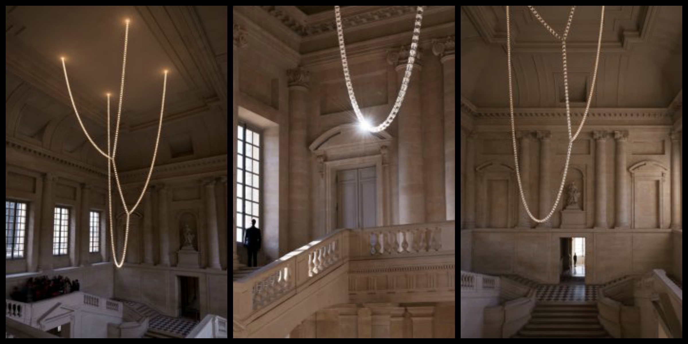
Another factor could be your point of view as well as the time of day. Some things look very different depending on where you stand how close you stand to them when viewing. Here are three different views of the piece:

2752_discussions.jpg?width=721

by the way, just for sake of comparison, here is what was used for lighting in the space before:

2753_discussions.jpg?width=721

Leopoldina
@leopoldina
11 years ago
280 posts

Thanks for these! I definitely like the before photo more, but still, I find it very elegant.

Georgiana Fitzherbert Grace
@georgiana-fitzherbert-grace
11 years ago
95 posts
Ugh how disgusting! It takes from the simplicity and grandeur of this staircase that chandelier is effortless...Why can't they install something that doesn't stand in the middle of such a beautiful room and distract... It looks like loose wires that have fallen in a cluster! There is so much to be done in Versailles with restoration yet they waste it on modern art to distract from the beauty that is there why not invest in regaining what was lost and stolen make it complete again. I'd rather see the petit trianon be fixed up and complete once again and to feel the presence of a time long since lost that look at things as horrid as this! I can't stand these foolish investments they make all the time it makes me want to flee from the palace in horror when I see a giant waste of money dangling from the ceiling!
Jane Ixtar
@jane-ixtar
11 years ago
115 posts

Yes Candice, the tone of the carpet compliments. Its wow. The light at least is light in feel. I think the version at VSL, it has cabling all through it which Ithink is ugly.

Jane Ixtar
@jane-ixtar
11 years ago
115 posts

Yes, notice the detailing on the top of the columns on the floor above and howit tends to be buried with the new installation.

Leopoldina
@leopoldina
11 years ago
280 posts

I think once the shock passes it grows on you. And yes, to see it in RL must be much better to understand it.

And your welcome, I must thank everyone for their input and contributions to this thread. When I saw this news I thought right away it could result in some nice discussion here :)

Sophia Trefusis
@sophia-trefusis
11 years ago
471 posts

I wouldnt say I hate it. I dont like it but I agree it doesnt add anything to the Versailles.

It would be one thing if the light installation had something to do with the history of the Palace but this is just some strands they hung up.

Sophia Trefusis
@sophia-trefusis
11 years ago
471 posts

Weird art installations scares me.

Sophia Trefusis
@sophia-trefusis
11 years ago
471 posts

I think one of them would be "doesnt he have any taste?":P

Tatiana Dokuchic
@tatiana-dokuchic
11 years ago
1,919 posts

Ok, I try really hard not to think badly of Charles Spencer but this really isn't helping any ;)


--
Proprietress of Tatiana's Tea Room ~ Owner of the Provence Coeur Estate ~ Webmistress of this site
Sophia Trefusis
@sophia-trefusis
11 years ago
471 posts

I think that one looks more estethically pleasing..more organic and also there is the shadows it cast on the walls which make it feel more natural. Its ornamental.

Tatiana Dokuchic
@tatiana-dokuchic
11 years ago
1,919 posts

I agree, love those shadows! Not too sure about the colours though.


--
Proprietress of Tatiana's Tea Room ~ Owner of the Provence Coeur Estate ~ Webmistress of this site